
Introduction

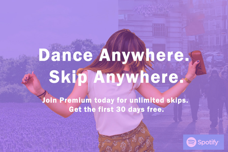
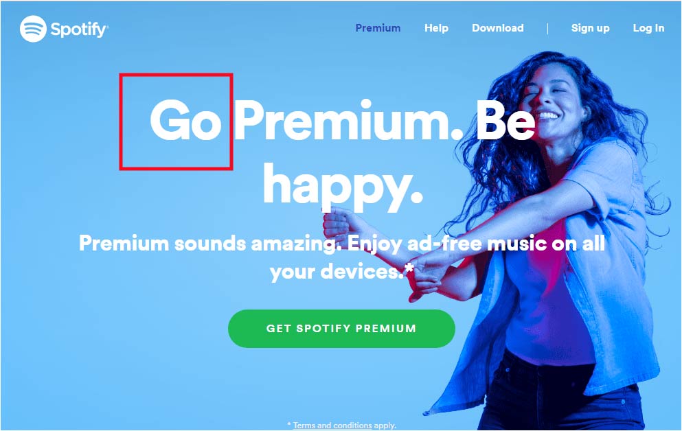
Above is the original ad that Spotify created. It is eye catching and color. It is a very good ad that influences others to get Spotify premium. I found this image of the ad on https://www.starfishmint.com/how-to-play-music-on-alexa-aka-amazon-echo/. And the Spotify website is https://www.spotify.com/us/.
My Remake Ad Analysis
Design- Proximity
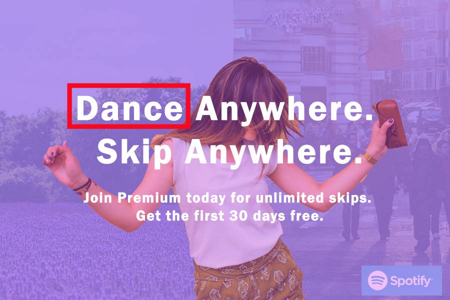
The ad I created has two groups. One being the slogan and the other being the information to get Premium. There are two groups being separated by size of font. At the same time, they are in the same group because they are both in the middle of the advertisement and they are the same font.
Design- Alignment

The alignment in the ad is in the text and the girl dancing. The text is centered and the girl dancing is centered with the text to get the point across and makes communication clear.
Design- Repetition
There is repetition in the word “anywhere”. This makes dancing and Spotify connected. When someone hears the word dance they think fun and happy and that is what Spotify wants people to connect.
Design- Contrast
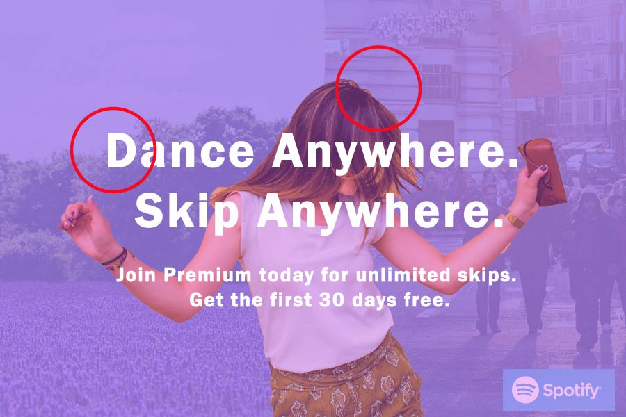
The contrast is in the color. First, the contrast is present in the in the background and the girl dancing. I wanted the girl to be more of the focus for the advertisement. The other contrast is in the wording. I wanted the words to stand out the most so they were white to stand out from the purple to have the eye go to the words first.
Color

I decided to use this light purple color because it is similar to the fun and funky colors that Spotify uses in their ads. Light colors show a happier feel to the ad.
Typography
For the typography the color is White and stands out from the rest of the ad. The same font is used throughout the ad to have continuity and repetition. The font is also in bold to make it stand out.
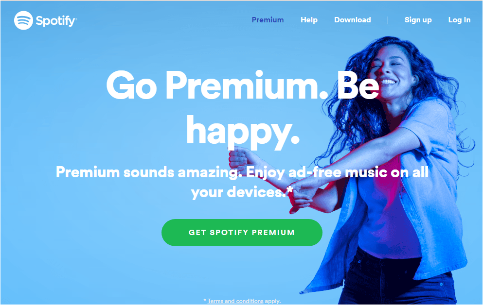
The Original Analysis
Design- Proximity
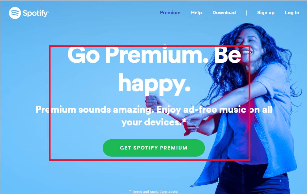
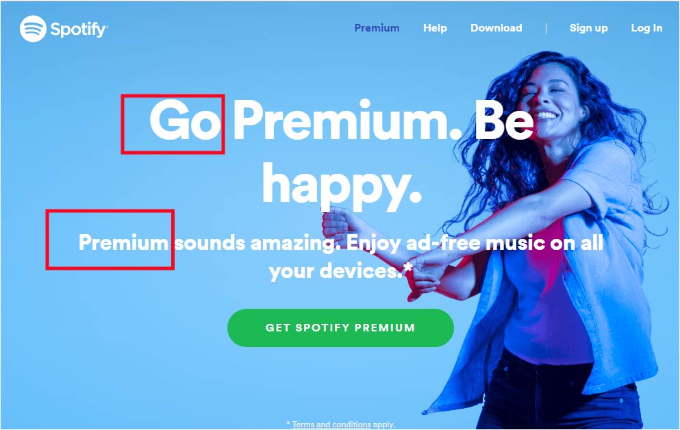
All the information is in the middle of the page to group it all together. This helps draw the eye to to information right away. This way the information is processed quickly.
Design- Alignment

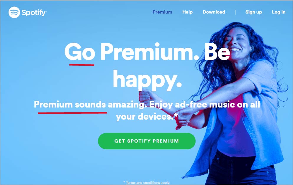
Again the words are centered. This is a great style for this ad because of how simple it is. With the centered proximity it is very organized.
Design-Repetition
Here the fonts are repeated to let the design flow through the whole ad. The repetition is so that all the information is showing that it is for one subject.
Design- Contrast
The contrast is also in the wording for the words. The whole background is blue so with the words being white, they really stand out. You can clearly see the background and the words and the background are not blending at all, instead they are standing out.
Color
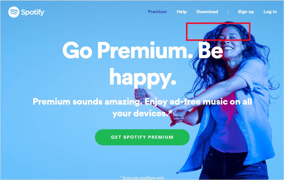
The color is the same the whole background. It even highlights over the girl dancing. this helps the words stand out more. But, to make sure that the girl stands out she has red lights hit her. This way she is more noticeable.
Typography
The typography is bold, white, and large. These attributes help the words stand out. The largeness especially, brings the eye to the words.
Conclusion
The two ads use the important factors of design, Color, and Typography to bring the ad all together. The two ads work together for the same company because they use fun colors, similar fonts, and the same tactic to draw the eyes to the words on the ad.
